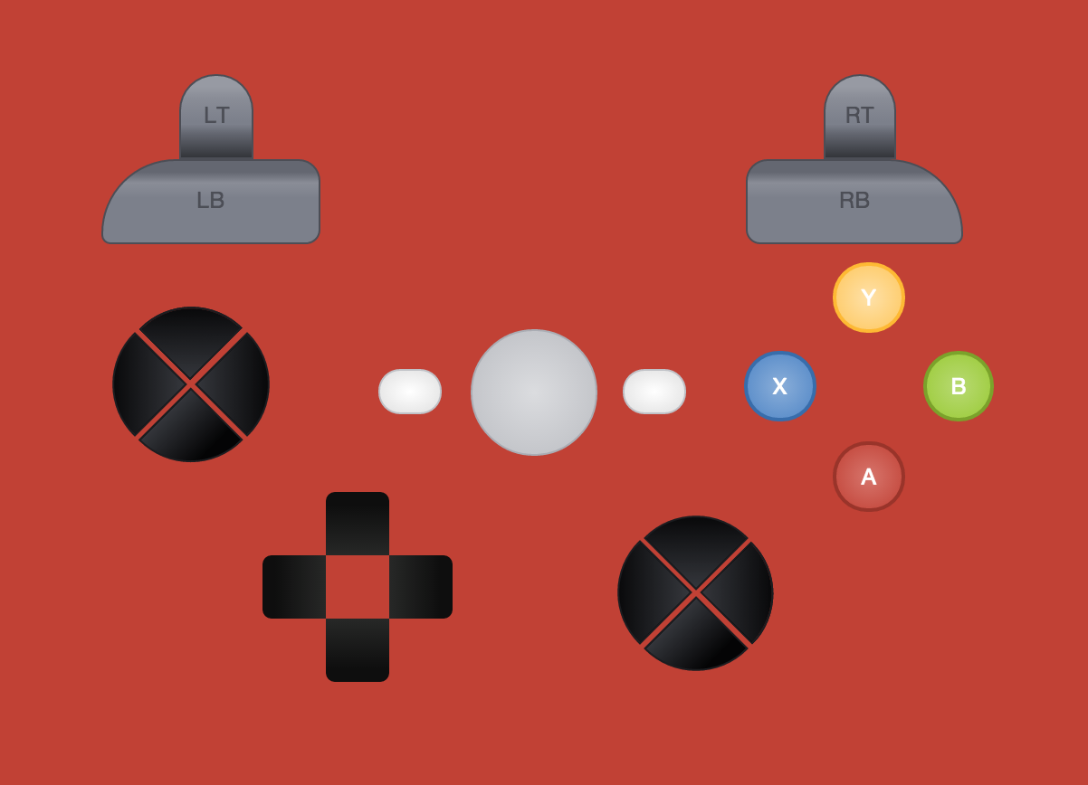
Work in progress controller layout created with HTML/CSS/SVG
Yellow screen – SVG
Red screen – HTML button tags with CSS
Blue screen – both combined
View it live & the code on CodePen.io: http://codepen.io/AlexBezuska/pen/MwemEv?editors=110
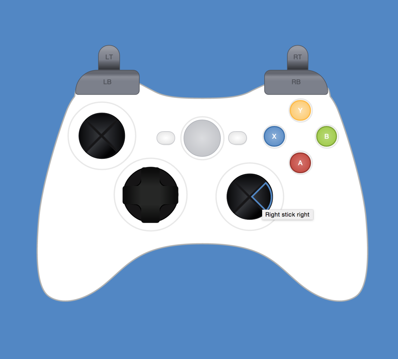
Work in progress controller layout created with HTML/CSS/SVG
Yellow screen – SVG
Red screen – HTML button tags with CSS
Blue screen – both combined
View it live & the code on CodePen.io: http://codepen.io/AlexBezuska/pen/MwemEv?editors=110
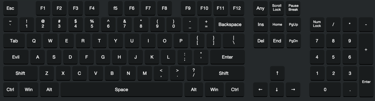
CSS keyboard layout I designed for our secret project 😉
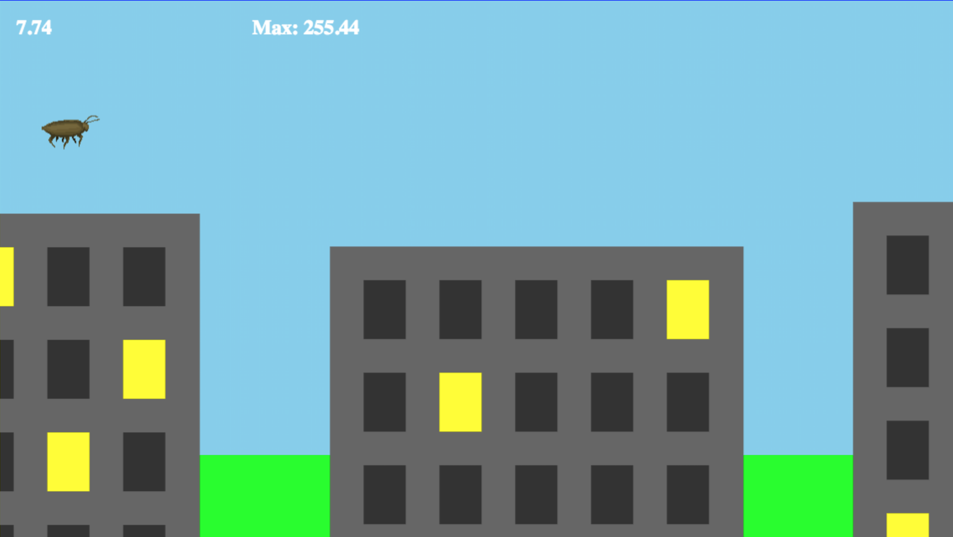
Scurry is an HTML5 browser game where you play as a beetle who is running through a grocery store. Run as fast as you can, pull off daring jumps, avoid shoppers, roach motels and other treacherous obstacles! How far will you make it?
The project is a two-person team effort; Eric Lathrop is doing the code, and I am working the artwork.
We just met up at a coffee shop for our first session and got a lot done, I am very happy with how it is turning out so far.
Here is a shot of the game with some shelf art and grocery store props added:
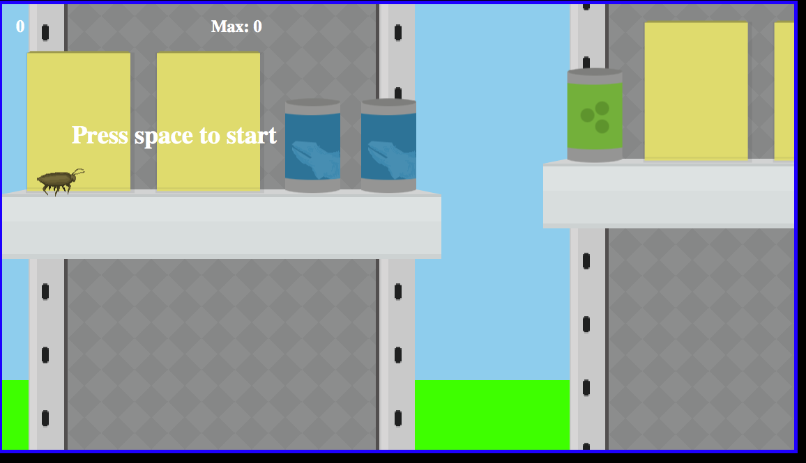 As of now, Eric has about 12 hours in of Dev time, and I have spent around 6 hours doing the artwork
I have some videos below that show the progress taking Eric’s engine and adding in the art assets I have been creating. Eric is working on generating infinite levels using repeating and randomized artwork, resulting in a new experience for the player each time.
 So when you first get into theming for a Content-Management-System you will more than likely take one of the existing base themes included with the CMS and start snooping around in the various files. You might just edit the ‘style.css’ file or equivalent – or you might go straight for the jugular and strip out all the html leaving only the relevant tags the CMS uses to fill in dynamic content, then add in your own markup around them. This is what I did when learning Drupal, and now that I am working with WordPress I started down the same path for a couple of client sites – but now I have found a real gem for any WP theming beginners out there and that gem is underscores.
A completely blank theme agnostic to any design direction to give you a blank canvas to work your creative magic however you want. No pre-supposed boundaries or grids, just a clean slate.
I really dont know what else to say – its exactly where you should start as a WP themer – and its open source and being refined and updates all the time via the GitHub repository.
Check it out here:
And let me know how it worked out for you.
-Go make the web a better place.
-Alex Bezuska
Have you ever been working on a client’s website and notice that the logo is not clickable?
Sometimes you may find someone embedded the logo into the header as one large image, and therefore when a user goes to intuitively click the logo to return home, nothing happens – this is bad usability.
Here is a quick and easy fix for that, with an added bonus of making the logo text readable in screen-readers for the visually impaired.
I’m sure I’m not the first to think of this, but I hope it helps someone who find themselves in the same situation. Please let me know if you have a better method, as I am always hoping to improve. Have a great day!